
experience a wilderness survival SITUATION
WHAT ARE YOUR SURVIVAL PRIORITIES
It all begun as a brief canoe trip. Experts advice that you should tell somebody where you are going and when you are getting back, at minimum. What if you'd skip that part? What if you'd go somewhere, and then even take a detour.
And what would you do when the worst case scenario happens? What if you lost your knife? Imagine going off-route and losing your cellphone. Matches? Yeah, maybe you have that one match. But how will you start fire after that? How you will get to safety?
What are your survival priorities?
GAMEPLAY & REALISM
Survive video game is entertainment, so an effort has been done to make the game feel realistic enough, but there are several things where realism had to be sacrificed to get a better gameplay. Some stuff is just boring and tedious in real life... and some things are just way too complex to be featured in a game. This game is highly complex one to learn.
SOLO DEVELOPMENT
I created the first version of the game as a Ludum Dare entry. That's a game jam where you have 3 days time to make a game. I published the first version after about 11 hours of development. Since then, a lot of things have changed. I've been working on this game for 1.5 years (2016) and poured hours and hours of effort in trying to make the game as good as possible.
Version 188 was published on November 11, 2016. That's a quite feature-complete game, but there are much more content to be added and much more work to be done. That work continues.
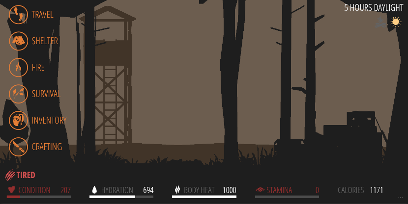
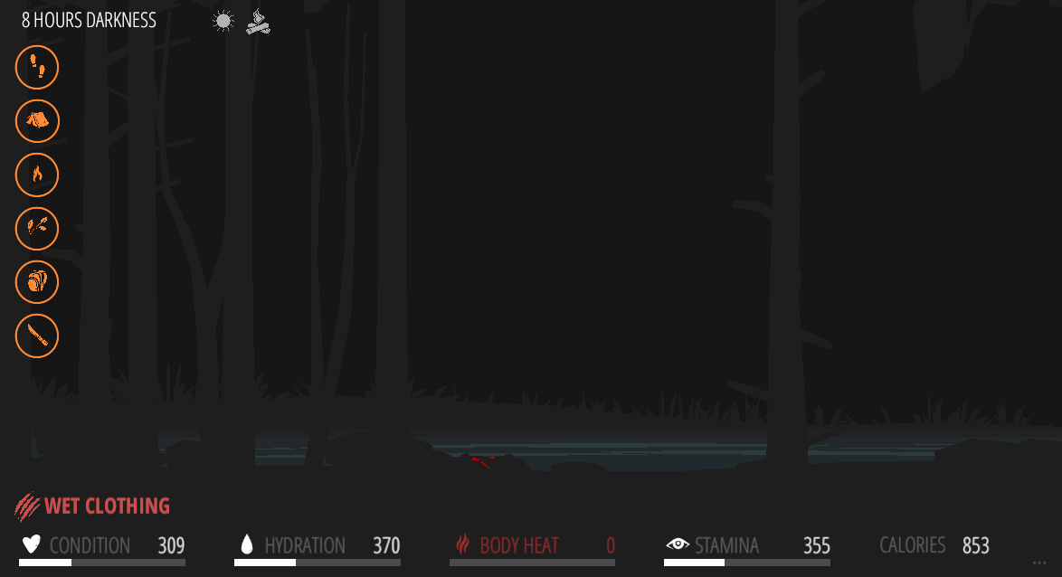
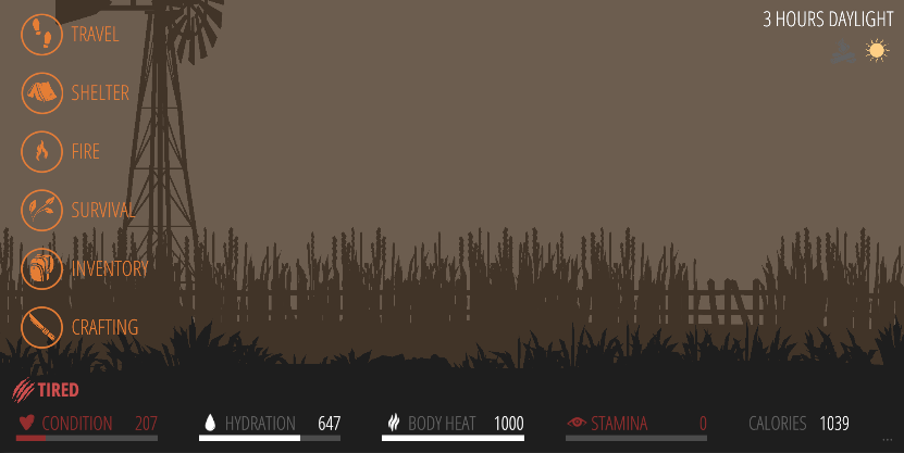
SHELTER
Shelter offers protection from the rain and cold weather. Without a shelter, the rain is deadly. And building a shelter in the darkness won't be an easy thing. Get your shelter built before the night begins.
FIRE
Without fire, you die. Fire is the ultimate weapon against the cold. Make sure you have energy left to start a fire. Save your matches if possible. Fire is also your tool for purifying water.
WATER
Get water. Stay hydrated. Build a raincatcher before it begins to rain. Explore areas for water puddles and wet moss. Purify water with fire.
CRAFTING, HUNTING, TRAPS, FISHING...
There are various ways to build tools of survival.
You can hunt in the game, but also fish and set traps.
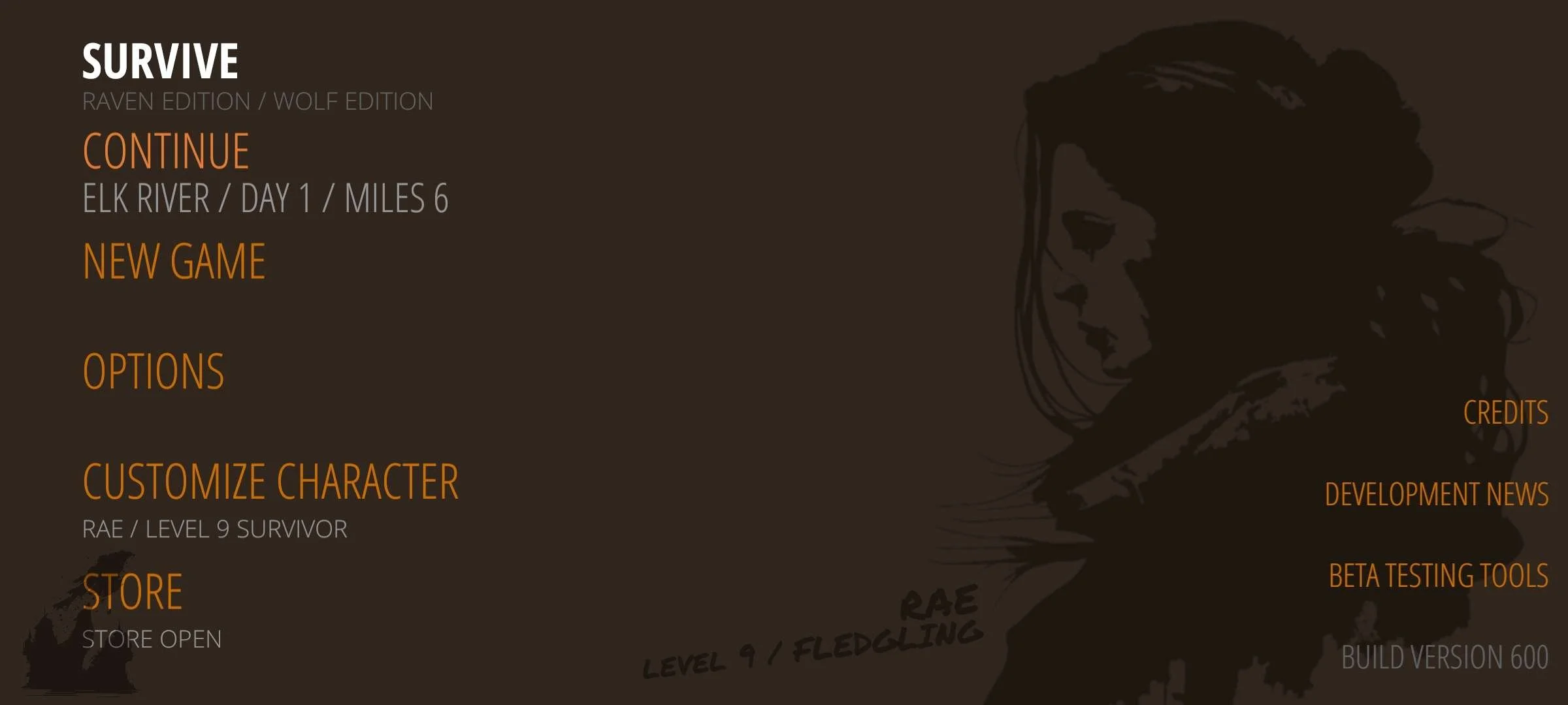
SURVIVE
The ultimate goal of the game is to get to survive. If your body heat drops to zero, it's game over. If your hydration drops to zero, it's game over.
The only way to win (in version 188) is to get to safety.
OLD SKOOL STYLE
Survive game is not about graphics. There's no fancy 3d models. There's practically almost no animations. There is audio, and some effects and little bit of graphics. This game is not about visuals. This game is about letting you the player imagine and experience the survival situation.
SCREENSHOTS
Version 600 is completely redone
Loot gear.
Take care of survival priorities
Traverse through the wilderness back to civilization.
CONTACT
Get in touch by emailing me at juuso@thesurvivegame.com